字Font of the week · · 2 min read
Fraunces: soft serifs with a mind of their own
Fraunces is a variable old-style serif by Undercase Type with axes for weight, optical size, softness and crooked letters. Free to use under the OFL.
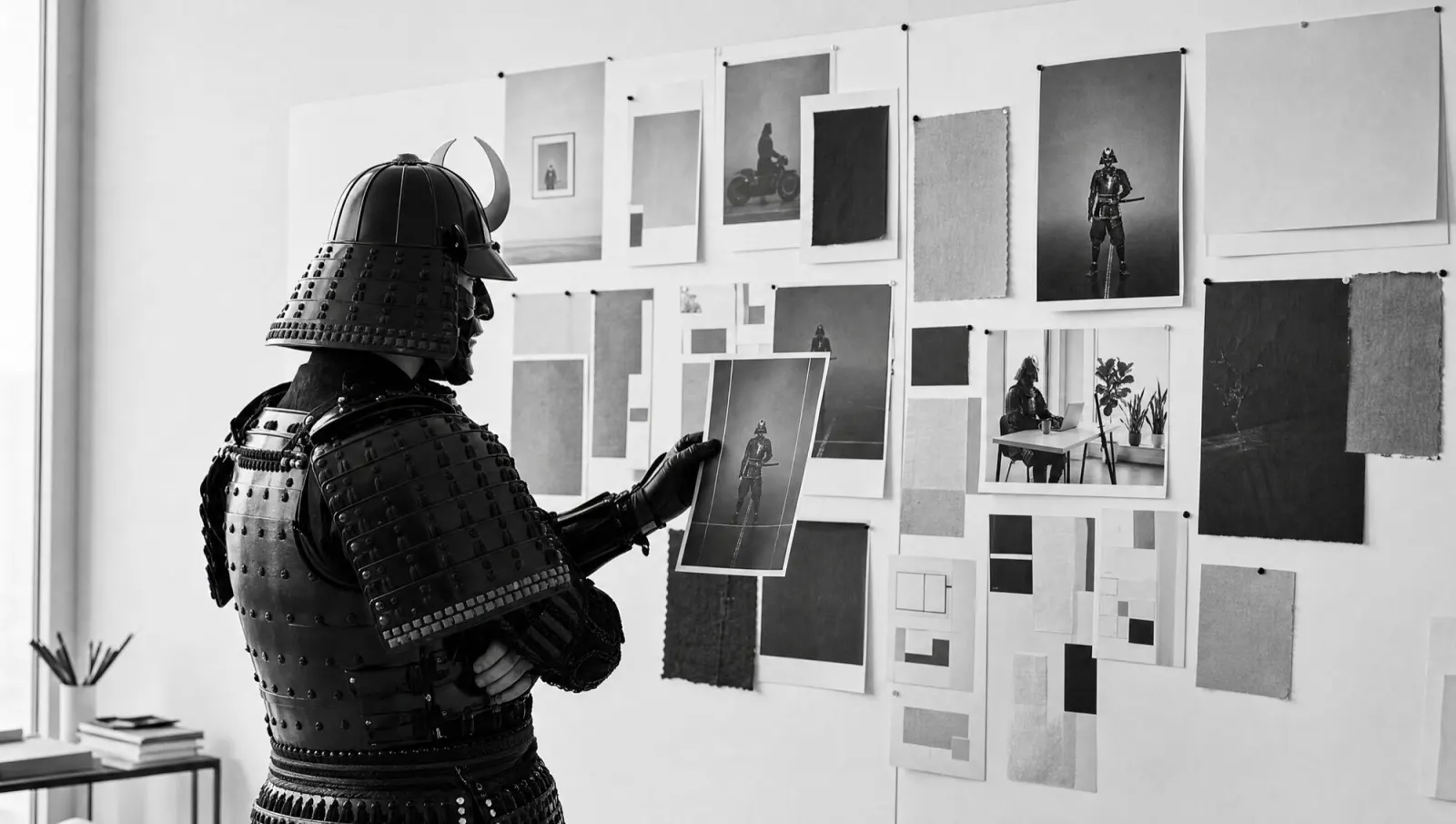
Fraunces has a softness slider that runs from 0 to 100. The samurai's armour ships at 0.
Fraunces was designed by Phaedra Charles and Flavia Zimbardi of Undercase Type. Google Fonts commissioned it in 2018 as a showcase for variable fonts, and it has been available there since 2020; its models are early 20th-century display faces such as Windsor, Souvenir and Cooper. It is licensed under the SIL Open Font License 1.1: you can use it freely, commercially too.
What sets it apart
- Four axes in one file: weight (100 to 900), optical size (9 to 144 pt), softness (SOFT) and wonky (WONK).
- SOFT rounds off serifs and corners, from crisp at 0 to inky and soft at 100.
- WONK tips n, m and h slightly to the right; in the italic, b, d, h, k and l get little flags. It switches on automatically above 18 pt optical size.
- At small sizes the x-height grows and the spacing opens up, so it stays readable at 9 pt.
The n is crooked.
Yes. On purpose.
What it is good for
Headlines, packaging, menus, shop signs, book covers: anywhere a brand should feel warm and slightly headstrong. Thanks to optical sizing and a proper italic it also handles subheads, captions and short paragraphs. For bakeries, cafés, small makers and publishers it fits almost too well.
Limits: it is too loud for long texts, forms and app interfaces; a calm sans belongs there. The look is distinctly seventies, so you have to want that. On the web you set SOFT and WONK via font-variation-settings.
Does 100 to 900, 9 to 144 pt, and crooked.
Twelve pastries, oilskins and a €3.10 deposit.
This week's exercise
Type your company name into the specimen above and see whether the crooked n suits you. If not, font-variation-settings: "WONK" 0 straightens it.