字Font of the week · · 2 min read
Fredoka: a rounded typeface for approachable brands
Fredoka is a rounded sans with weight and width axes, free under the OFL. Strong on packaging, signs and apps, weak in tables.
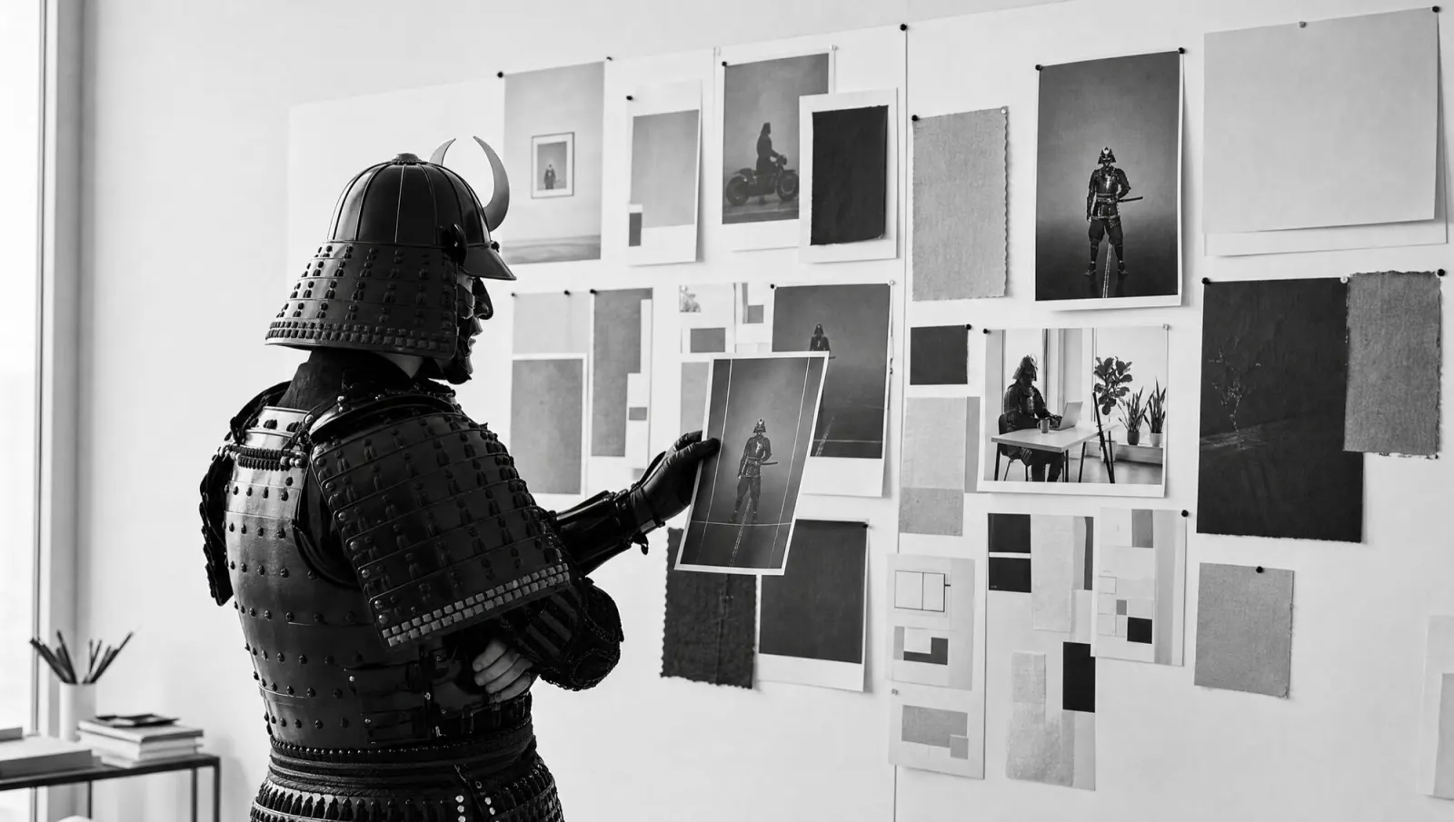
The samurai stuck a "Caution: sharp edges" label on his armour and set it in Fredoka. It now reads like an offer of free hugs.
Fredoka is a rounded sans. Milena Brandão drew the Latin part, Ben Nathan the Hebrew; his Israeli type studio Hafontia leads the project. Since December 2021 it has been on Google Fonts as a variable font under the SIL Open Font License 1.1. You can use it freely, commercially too.
What makes it stand out
- Not a single corner: every stroke ending is rounded, including the t, the f and the arms of the k.
- Two axes in one file: weight from 300 to 700, width from 75 to 125.
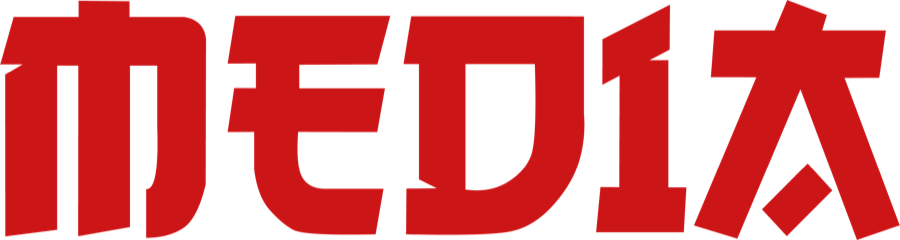
- At width 125 the o, e and d turn into wide ovals; at 75 they are as narrow as tablets.
- Latin and Hebrew in one family, plus fractions and superscripts as OpenType features.
Make it rounder.
It's a circle.
What it's good for
Headlines, packaging, signage and app interfaces, wherever a brand should feel approachable: food, children, sport, leisure. The width axis helps when words differ in length and the label has to stay the same size.
Limits: there is no italic. The figures have different widths, so prices in tables do not line up cleanly. Characters such as č, ą and ș are missing, which rules out Czech, Polish or Romanian.
For anything that should feel friendly:
ice cream, nursery, price rise.
This week's exercise
Put your longest and your shortest product name into two boxes of the same size and balance them using width alone: font-stretch: 75% to 125%. If both feel equally loud, the typeface suits your range.