字Font of the week · · 2 min read
Bungee: a typeface for signs and vertical type
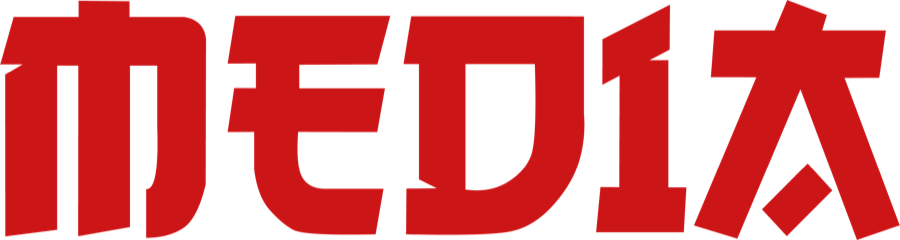
Bungee is a display typeface inspired by shop signs. It sets vertically with upright letters and is free to use.
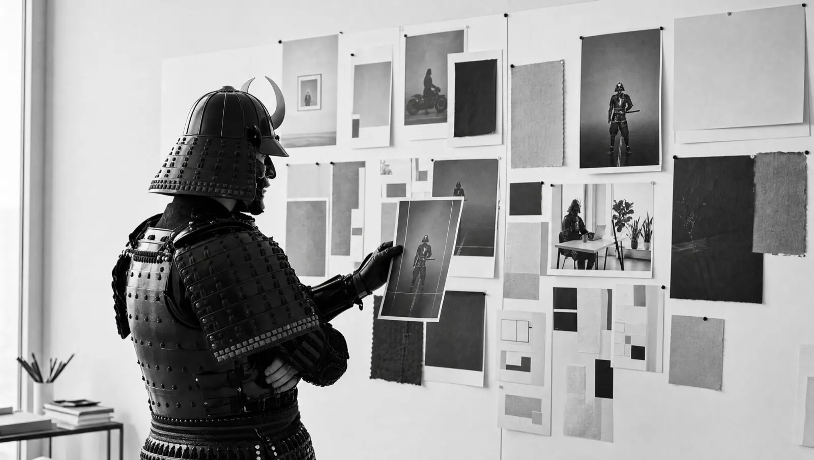
Most vertical signs make you tilt your head 90 degrees. The samurai's helmet allows 30.
Bungee is a display typeface by David Jonathan Ross, modelled on urban shop signs and neon lettering. It has been on Google Fonts since 2016, currently in version 2.000, under the SIL Open Font License. You can use it freely, including commercially.
What sets it apart
- It sets vertically with upright letters, with its own spacing and kerning for the vertical direction. On the web,
writing-mode: vertical-rlandtext-orientation: uprightare all you need. - Round letters such as O and G have straight sides, so they stack neatly and stay compact in horizontal lines too.
- Capitals only: whatever you type in lower case comes out in capitals. Umlauts, ß and € are included.
- Stylistic sets add a round E, an I and L without serifs and an alternate &. There is also a Hairline, plus Inline, Outline and Shade styles that can be layered in colour.
BACK IN 5 MINS.
SINCE TUESDAY.
What it's good for
Shop signs, hanging blade signs, food trucks, menu boards, packaging and short headlines on websites and in apps. Anywhere a word has to work from five metres away, and especially where it has to run vertically.
It's not for body text: set your terms and conditions in Bungee and you've built a neon sign. There's no lower case, no italic and, besides Regular, only a Hairline. Pair it with a calm sans for anything under 20 pixels.
BIKE REPAIRS · KIOSK · FOOD TRUCK
MON–FRI 8–6 · SAT 9–1
Your exercise this week
Set the name of your shop or product vertically in Bungee, print it and stick it on a wall five metres away. If you can read it from there, it's fit for a sign.