字Font of the week · · 2 min read
Bricolage Grotesque: headlines with character
A variable typeface with three axes, freely licensed. Strong in headlines, on packaging and signage, weaker in long body text.
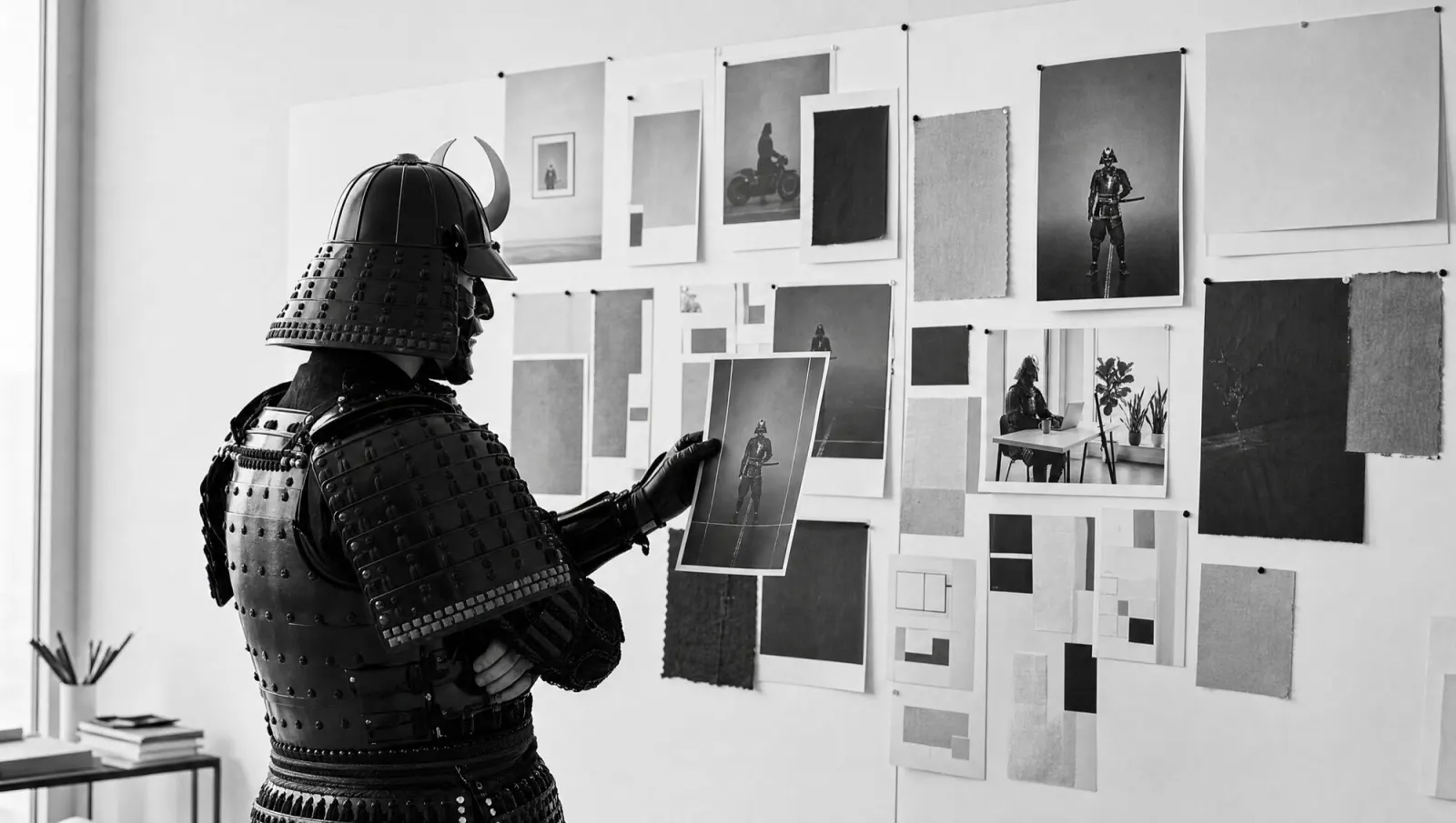
The samurai has a weight axis too. It's set to Black, and the slider has snapped off.
Bricolage Grotesque is by Mathieu Triay. It started as a fork of Mayenne Sans by Jérémy Landes and has been on Google Fonts since 2023, under the SIL Open Font License. You can use it freely, commercially too.
What sets it apart
- One file, three axes: weight 200 to 800, width 75 to 100 per cent, optical size 12 to 96.
- The g with a closed loop makes any headline recognisable at once.
- Notches at small sizes (ink traps), so corners don't clog up in small text.
- Condensed, it gets quirky; at normal width it stays calm.
Make the logo bigger.
No.
What it's good for
Headlines, posters, packaging, signage, website headers. The condensed styles fit long words on one line. Body text works at normal width and a medium weight, and tabular figures are included.
The limits: there are no italics. Condensed styles below 20 pixels get tiring. And if you mainly want to look sober, you will find it too playful.
Body text stays calm as long as the width is normal.
Open 08:00–17:30 · From €49.00
This week's exercise
Set the headline of your most important offer page once in your current font and once in Bricolage Grotesque, weight 800, width 80. Compare both on a phone at 375 pixels wide.