道Dojo · · 2 min read
Why your clients should see the new website in fullscreen first
A website is not a screenshot. Show it for the first time as a postage-stamp preview and you get feedback on the stamp. That is why our review stand opens new versions in fullscreen first.
The worst moment for a new website is its first appearance in front of the client. Usually it looks like this: a link in an email, opened between two meetings, on a laptop, in half a browser window. Or, worse, a PDF of screenshots where nothing can be clicked.
The first verdict then falls on the wrong thing. On spacing that feels completely different in real life. On an animation that does not exist in a screenshot. On a menu nobody has seen on a phone.
The first impression is an approval
So we solved it differently in our client area. Our clients approve websites in the review stand. It holds the staging version, the real site before launch, not a picture of it.
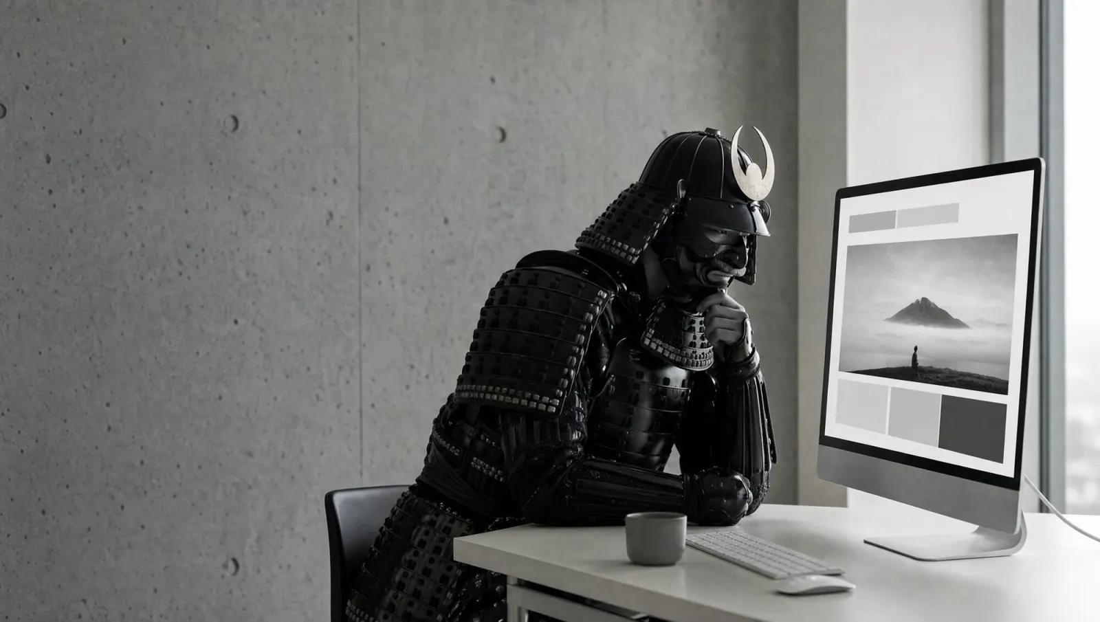
When a new version is opened for the first time, there is a short premiere: the site appears in fullscreen, at real size, with no frame around it. Until a version has been seen once in fullscreen, the small preview stays closed. That sounds strict. It is simply consistent: nobody judges a cinema poster on their phone's lock screen.
Then it gets specific
After the premiere it is about details, and that is what the review stand is built for:
- Comments right on the element. Click the headline that does not work and write what bothers you. We see the page, the device, the window size and the spot in the code.
- Desktop, tablet and phone. Every view at real width. Viewing the site in fullscreen on a device ticks that device off automatically.
- Seal page by page. Every page is approved on its own. Only when all pages are sealed, all devices viewed and the checklist done can the launch approval be given.
This is not an end in itself. Every comment attached to the right spot saves a follow-up question. Every page that was sealed deliberately is a page nobody is surprised by after launch.
What you can take from this
Even without our tool: never show a new website small first. Sit down with your client, fullscreen, real device, real content. Collect feedback at spots, not in paragraphs. And separate the first impression from the detail work.
In the end the site has to hold up in fullscreen. So that is where it should start.